Creating Comic Books with Halftone (Grade 4)

Who doesn’t love a comic book? Maybe I should rephrase . . . What kid doesn’t love a comic book? Well, the answer is probably a fair few, so let’s try one more time. What kid doesn’t love creating a comic book? Ah, now the answer is much higher. Probably most kids, I would think. Judging by my students, there was a lot of fun to be had in this project. I also think it’s important to pitch it at the right age. Grade 4 for this project (that’s 9-10 year olds) is the perfect age. They are young enough to love the idea, but literate enough to craft a cohesive story.

So, the project was this. I told the students to go out and think of a photo story. Around 10-12 images photos would be ideal. Think of what the story is, and what photos you need to take to tell the story. That was a whole session in itself.

From there I modeled how to use Halftone (actually Halftone 2 is what we used). We also had a discussion on what elements make up a comic page. This page on Wikipedia was ideal in helping me to prepare for this. I showed how to create pages, find templates for the panels, insert speech bubbles and captions. Most importantly, I showed them the edit tool and what you could do. From there they went about creating their own comic book.

The kids had a great deal of fun with this. The app was a little challenging to them the first time they used it, but once they got into it, they flew through the process.

When saving their work, there is the option to save each page as an image, or the whole thing as a PDF, but it actually works really well as a video!

Here is a video that models the app – and again, apologies for the sound quality. That’s what you get for recording when you’re out of the country!

Here is one particular example I really enjoyed.

Crafting Animal Composites with Photoshop CC (Grade 3)

This is my first big regret of the year. Not that the idea behind the project wasn’t a good one, but that the expectation was perhaps too great for my Grade 3 students, who are still very new to Photoshop.

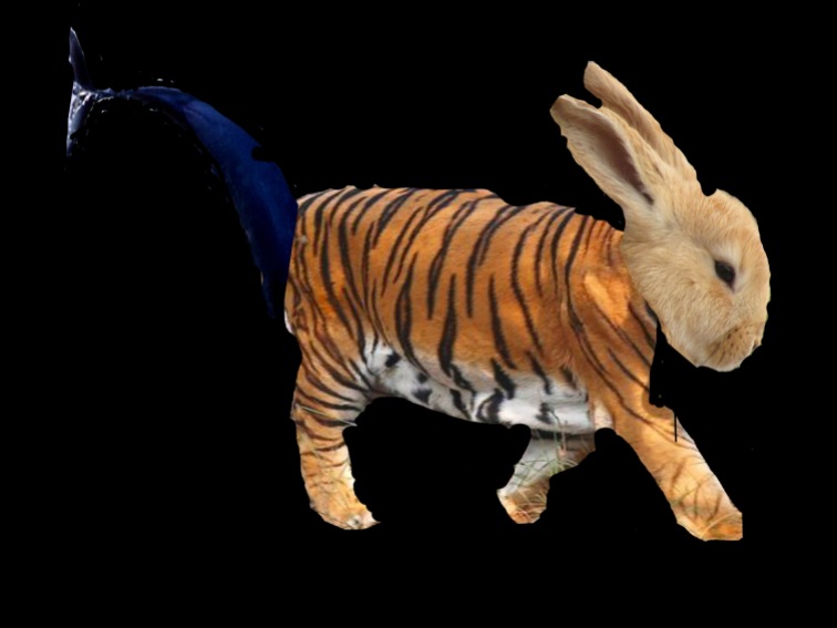
The genesis of this project started with a conversation with the teachers in the Grade 3 team. Something I do regularly is to check in with the teams to see what they are covering in the upcoming term to see if I can those themes to my lessons. In this case, they told me that the students would soon be doing a unit on animal adaptations. They further told me that in the past they have done a fun engagement activity with the kids where they can design their own animal, using different animal bodyparts. I got the impression this was usually done as a sketch. Could this be done in Photoshop they asked?

The answer, of course, is yes – it can. The more important question is, are the students up for it? That, I was not so sure about. It usually takes some practise with a variety of tools (such as the quick selection tool, the magic wand, quick mask, etc) to make a good selection that you can then remove a background.

I planned this lesson to come right after the one they did on selecting and removing the background from superhero pictures (which is covered in a post last year here). In that case, the images were chosen by me, and had varying levels of difficulty in selecting the background correctly.

In this activity, students were to choose three animals. They were to find the pictures on Google and save them to import into Photoshop. But – there were some guidelines first. Each animal needed to be facing the same direction to make it easier. I wanted the students to visualise how they wanted the creature to look in their heads, before they finalised which pictures they were going to use. Most students followed this, but some still had some problematic choices. It says something about the kind of teacher I am, in that there were cases where I let the students choose difficult pictures so they could see where the problems would lie when they brought them into Photoshop.

In any case, the project was simple enough in concept. Bring in three pictures to Photoshop – each on a seperate layer. Choose one animal for the head, one for the body (including legs) and one for the tail. Cut out the background as best you can, and make any transformations needed to put together the animal.

The results were fairly mixed, it’s fair to say. This is perhaps one for a Grade 4 class who have a little more experience in using Photoshop. Nevertheless, the students were all pretty happy with how their menagerie came out.

Below is a video describing the workflow in Photoshop, and under that are some student examples.

Harnessing the Power of the Creative Cloud (Grade 4)

I had in my head for a long time an idea to have a project that starts from a photo, worked on with an iPad, and finished off using a desktop computer – and using a variety of Adobe tools to show the power of the Creative Cloud.

The lynchpin to all of this is the app Adobe Capture. This recent app is an amalgamation of various Adobe mobile apps like Adobe Color, Adobe Brush, Adobe Hue and Adobe Shape. Essentially it’s a way to capture a photo and create a shape, a pattern, colours or even a look (essentially a colour graded filter) to apply to other images.

Ok, so here’s what I asked the kids to do. I told them to go out and take two photos. One photo that you will use to create your own custom brush, and one photo to create their own custom pattern. Although I had showed them what a custom brush and pattern looked like before they went out, I saved showing them how to do it on the app until they all came back in. By the end of the first session, they had all saved their brushes in a creative cloud library on the iPad.

The second session was using the app Adobe Sketch and choosing their custom brush from the creative cloud library. Using that brush, they were free to draw whatever picture they wanted. Those pictures were then saved into their creative cloud libraries.

The third session they got on the computers in Photoshop to open up a template I created. The template (see below) basically has a transparent background and a lower third on top with some text to write over with their names. They needed to access the creative cloud library and bring in their sketch and then their pattern and put that as their background. Finally, they needed to put their names on the lower third.

So, you can see, plenty of fun to be had, and lots of creative choices along the way. I should say, there are a couple of issues using creative cloud libraries. Let’s go through them and what I did about them.

1) You need to have an Adobe ID to login to creative cloud, and you need to be 13 years or over to have one.

Ok, so my kids are younger than that. So I do what every other teacher does, and that’s create class accounts. I have 13 iPads and 13 computers. Each computer and iPad (say # 1) are linked to the same account. So you can create an Adobe account like yourschool+1@gmail.com and link the iPad and computer to that. Not 100% kosher, but not illegal by any means. I know plenty of educators that do this for their classes.

2) You need to have a license at your school that supports Creative Cloud libraries.

Check to see what your license includes, because many do not allow connections to the creative cloud.

Having said that, this was a fantastic project and I loved what the kids came up with. Below are three videos (one for each session) that goes into the workflow, and below that are a few examples from the students.

** Apologies for the sound. I wasn’t at my usual recording locations **

This slideshow requires JavaScript.

15

Faking Depth of Field in Photoshop CC (Grade 6)

Since all year levels from Grade 3-Grade 6 last year did my Photography 101, I thought that I would get the older students ready for Photography 102. Now they know a little bit about how Photoshop works, I wanted to teach them the principals of depth of field and how it’s used.

Simply, the depth of field in a photo is the area that is in focus. A shallow depth of field means a small amount in focus, a wide (or deep) depth of field has most of the area in focus. I explain to the students that a camera lens can only focus on one single point. The area that stretches in front and behind that focus is the depth of field.

We look at some portraiture examples of how a shallow depth of field can help bring the subject to sharp focus. We look at examples of macro photography that does the same thing.

Now a camera in automatic mode will likely try to bring the photo into as much focus as possible. When you want to play around with that, on a SLR camera, you could be adjusting the focal length of your lens or adjusting the size of your aperture, which is measured in f-stops. The wider the aperture, the smaller the f-stop value. This greatly depends on the lens of your camera.

Now, remember, we are currently using iPads to take photos, so unless you use a specialised app, you can’t play with the aperture. Even with those apps, it’s essentially faking the effect. I would rather discuss aperture when we eventually get some SLRs in, so what we are doing is faking the effect inside Photoshop.

The workflow is pretty easy to understand. Load up a photo in Photoshop, select the background, and soften the focus. For our purposes, that’s all there is to it. Of course, professionals would go to great pains to make the effect look as natural as possible by perhaps feathering the effect, and so on. But the students are really only looking at blurring out the background.

So we go back to the techniques we learned last year about selecting an area in a photo using the quick selection tool and brushing a selection using the Quick Mask tool. Those two are the best ways, but I also showed them the lasso tool as a way to start of making a selection and then refining it with the tools they know.

Here is a before and after of the image of my daughter that I used for the example.

The students had to go out and quickly take their portrait shots. Each pair partnered up with another and their partner group took a photo of them. The photo of themselves is what they used for the work. I told them that they needed a photo that had some distance behind them otherwise it wouldn’t be as effective.

The lesson was understood very easily, but students are still at varying degrees of getting their selections perfect. But for this project, accuracy wasn’t so important, as we wanted it to look more or less like a realistic area not an absolute exact measured out area. In other words, we were trying to make it look imperfect so you can’t tell it’s photoshopped.

Here is the video where I explain the techniques in creating the effect inside Photoshop:

And here are a few of the students’ examples:

Tilt Shift Photography (Grade 5)

Tilt Shift photography is a cool effect where you blur the top and bottom of an photo that is taken from a fair distance away. As your brain is used to seeing backgrounds blurred when looking at a close up macro photo, it tricks your brain into thinking that what you are seeing is a scale model. Here are some cool examples of the technique.

There are attachments you can buy for an SLR camera that makes your lens a little flexible and lets you physically tilt the lens to create the effect in camera. Otherwise, you can just fake it using Photoshop.

So, I started by showing my students some examples and how the technique works. I then took them step by (small) step to achieve the same result in Photoshop by first converting to a smart object, and then applying the Tilt Shift Blur filter in the Blur Gallery.

From there, the students learned how to paint in the layer mask to reveal or conceal the tilt shift blur as they needed. Please watch my video tutorial below.

Here are some of the better examples my students came up with.

Textured Word Art (Grade 5)

This is a simple little project students can do to start learning how layer masks in Photoshop work.

Essentially, the project asks them to take a photo of textured material and to create a new file in Photoshop, type in the name of that texture “ie: Bricks” and have the photo of the bricks come through the text.

This is made possible by putting a layer mask on the type layer that has “BRICKS” written on it, and pasting the photo of the bricks on to the layer mask itself.

This is not typically the way we use layer masks. Usually, as you will see later in the post on the Tilt Shift effect in Photoshop, a layer mask is used to paint in (or paint away) an adjustment, effect or filter. Layer masking allows you to hide or use as much of any one layer as you like. It is a black and white image that cuts out a layer, allowing it to show though wherever the pixels are white, and holds out or hides a layer wherever the mask is black. The common adage to layer masking is that “white reveals, black conceals”. This will be more evident when watching my video tutorial below:

So – quite a simple little project. I started off by sending them out of the classroom for 5-10 minutes to photograph on the iPads a texture they want to use. They then uploaded the photo to the class’ Google Drive folder. Once the project was completed in Photoshop, I asked them to substitute the black background for another image that another group used that was in start contrast to the texture they had used for their type. I also showed the students how to use layer styles to highlight the type more.

Here are some examples:

This slideshow requires JavaScript.

Cloning Photos with Clone Camera (Grade 4)

Here’s an example of a project I wanted to do with the kids where I have an idea and think to myself – I wonder if there’s an app for that. And of course, nine times out of ten, there absolutely is.

Clone Camera does exactly what it says. It allows you to take multiple photos of a person (or persons) in different spaces and stitches it all up together in one photo. Here is the first test shot I did when I was learning how to use the app.

So you get the idea. The neat thing about it – just like stop motion apps – is that it shows you an onion skin of the previous frame. In other words, when you are ready to shoot photo #2, it shows you the ghost of photo #1 so you can make sure you’re in a good spot as well as being able to match eyelines, as you can see in the above example with this student in the fourth and fifth pictures.

This app is pretty intuative to use. You take your photos, and then with each picture (not the master shot though) you paint in the areas you want to keep in the final photo. You have to be careful though. The onion skin feature only works for the last photo taken. So you have to make sure the subject (or subjects) are in seperate enough spots so that there is no overlap. Here’s an example of one group of students that obviously went a bit wrong in that area.

You can see here that one boy’s leg has overlapped another boy’s head. The photo below shows another thing that can go wrong if you don’t paint everything in you want to keep.

In case you can’t see it, the girl on the far left of the frame didn’t paint her arm and leg properly, hence the unintentional amputation!

This requires a camera that is locked off at a certain spot. That means it needs to be fixed to a tripod so that it doesn’t move when you take the three or four shots you want to take. After that the process is fairly simple.

See the video below to see how the app works.

The project is a lot of fun, and the students came up with some pretty impressive shots. Below is a couple of examples that worked well.

Shooting Panoramas with an iPad

So where as I had the grade 1’s reinforce their basic iPad camera skills doing Macro Photography, the grade 2’s did something similar, but exploring the Panorama feature in the iOS camera app.

I started by showing some examples of what panorama photography entails. Giving a stock standard definition of a panorama (that is “an unobstructed and wide view of an extensive area in all directions”) really means virtually nothing to Grade 2’s from the outset. However, unpacking each element (obstruction/unobstruction, wide view, extensive area, all directions) started painting a picture in their minds before I showed them an example of one I had shot at our school.

From there I gave them strategies on how to keep the camera steady when shooting a panorama; how to keep the arrow on the line steady, and how to crop the photo afterwards if they have any black spots which indicate missing pixels.

It’s pretty simple technique just using the built in iOS camera and having a go. The students really enjoyed taking this new type of photo and came up with some pretty great shots. Here are just a few examples.

Turning Photos into Sketches with Sketch (Grade 2)

Sketch is a pretty basic app, I’ll admit. There are a number of good filters here to change a photo into a sketch, but unlike Brushstroke, you only have two possible adjustments you can make – brightness and contrast.

Having said that, there is something to be said for an app that’s simple and intuative for younger students to use. Aside from the filters, a really good teaching point would be choosing an appropriate filter for the photo they have taken. Not all filters look good on every photo, so you need to be picky about which one complements the photo you are trying to “sketch”.

The video of how to use the app is below.

Here are some of the better examples from the Grade 2 students.

Turning Photos into Paintings with Brushstroke (Grade 2)

Grade 2 is one of those levels where I have to dream up new projects since they have done everything last year I dreamed up for the Grade 1-2s. The lesson here and the one that follows (Turning Photos into Sketches) is basically how to use a filter app. With older students, I don’t like these kind of apps because it doesn’t give a lot of creative control over what happens.

I don’t mind so much at this level though. At the very least it gives the students an understanding of what filters are, which will benefit them next year when they start on the desktops using Photoshop and other applications.

I’m quite picky then with the apps that I choose for this sort of thing. I don’t want a “one-button-will-do-it” because I want the students to have as many choices and as many options for adjustments as possible.

This app is a good one for the amount of filters it presents you with, and then the ability to fiddle it with a lot of different adjustments like saturation, exposure, brightness, contrast and vibrance.

The video below shows how to use Brushstroke.

Here are some examples from the students.